|
|
Post by zx10racer22 on Jul 11, 2024 22:53:26 GMT
If, hypothetically, the club gave fans the option of the three proposed badges or retaining the current badge, what would your preference be? Option 1: 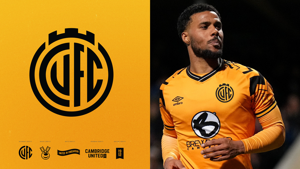 Option 2: 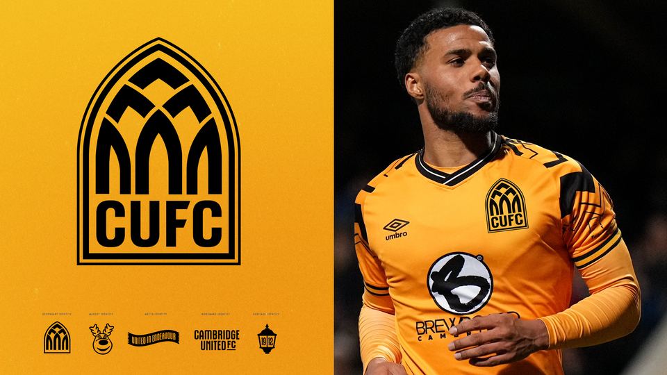 Option 3: 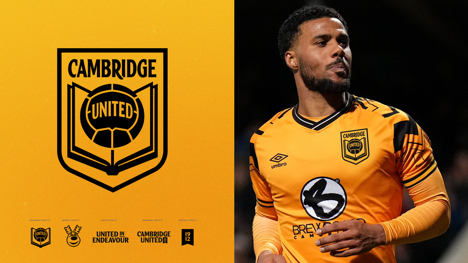 Option 4:  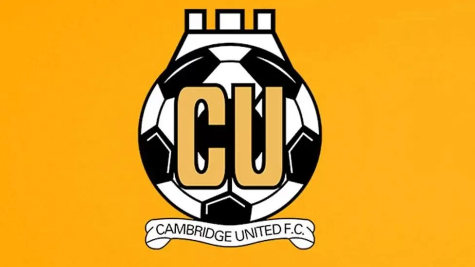 |
|
|
|
Post by Jonah (Option 3 Badge Chooser) on Jul 11, 2024 23:00:08 GMT
couldn't even be arsed to edit it onto the picture of kachunga? typical option 4 chooser laziness
|
|
|
|
Post by zx10racer22 on Jul 11, 2024 23:08:07 GMT
couldn't even be arsed to edit it onto the picture of kachunga? typical option 4 chooser laziness I tried to find the original online, but nothing more. Apologies for my lack of work ethic. |
|
tommy
Youth team regular

Posts: 771
|
Post by tommy on Jul 12, 2024 5:35:13 GMT
This is an outrage. Should be two polls. New badge yes/no? If yes, then which new badge? I'm logging out of the site for three days.
|
|
|
|
Post by Exiled on Jul 12, 2024 5:57:53 GMT
I think it's time for a change. I'm not keen on the non-sensical 'CU' I did earlier say some version of number 3, but actually, at first glance I preferred number 1, and I've gone back to that. It's the best of the 3 new suggestions on offer.
|
|
Dylan
First team substitute

Posts: 6,567
Favourite CUFC player: Dion Dublin
Favourite CUFC match: CUFC v AFC Halifax 04.05.14
|
Post by Dylan on Jul 12, 2024 6:25:22 GMT
I think it's time for a change. I'm not keen on the non-sensical 'CU' I did earlier say some version of number 3, but actually, at first glance I preferred number 1, and I've gone back to that. It's the best of the 3 new suggestions on offer. Yes, I'm now almost certain no 1 is the best option (and what will be selected). It's not original with its imitation of River Plate and Internazionale but those two, for me, are classic designs, so not the worst thing in the world to copy. I don't think book and ball will age well, and I think the United is a bit lost in the full design with the shield (looks good as the secondary though). I like elements of all three. I'd hope we can keep the lamp motif somewhere! |
|
|
|
Post by burwellu on Jul 12, 2024 6:26:10 GMT
The more I look at option 1, the more irritated I get by the fact that it starts and ends with a ‘C’ but those two letters are completely different shapes.
|
|
foolhandy
Youth team star
Posts: 1,334
Favourite CUFC player: Spriggs. Dublin. Pitt. Lennett.
Favourite CUFC match: vs Leicester C (H) 1982. Without that...?
|
Post by foolhandy on Jul 12, 2024 6:46:01 GMT
Got to be Option 1 I think, although as stated before I think it needs the outer circle/bridge to make it ours.
It's circular for social media, simple so it resizes well, and is really easy to recolour as is the vogue. I think it would last age well too. Has a vibe of local pub team knocking up a badge in homage to RP/I but the reason they do that is because it's a good look. Trying to get all the Cambridge United things into one design is what led to last year's nonsense design - that's what the other identities are about and they do a great job.
Two other thoughts, one less serious than the other...
Option 5 - Just stick Marvin on there.
Option 6 - The lamp with CUFC in there rather than 1912.
I'll get my coat.
|
|
|
|
Post by Andrewlang on Jul 12, 2024 7:06:34 GMT
I voted option 4 because 🥰 but in reality we know it's not an option and if the priority is trying to grow a business it's probably best not to let sentimentality get in the way.
A redesign is probably long over due anyway and i've made my peace with that. Farewell badge my dear friend, it's been an amazing run. Time to go to sleep now, I'll always love you x.
Andrew 😢
|
|
|
|
Post by El Goodo on Jul 12, 2024 7:20:28 GMT
Strang out.
|
|
Tom Shaw's Fist of Rage
Fans' favourite

Posts: 11,140
Favourite CUFC match: Promotion Final vs Gateshead 2014
Member is Online
|
Post by Tom Shaw's Fist of Rage on Jul 12, 2024 9:11:58 GMT
NO OPTION 5 "SIGN SOME BLADDY PLAYERS", IS ZX RACER BEN STRANG IN A WIG? MAKES YOU THINK
|
|
Wingco's Boy
Reserve team substitute

Posts: 2,185
Favourite CUFC player: Dion Dublin
Favourite CUFC match: Newcastle FAC 3rd round 2022
|
Post by Wingco's Boy on Jul 12, 2024 9:21:05 GMT
I don’t like the current badge or any of the new options, but if I had to choose, I would take any design, ANY, that spells out the name of our club. We are one of three CUFCs in the league, so one and two should be binned outright.
|
|
|
|
Post by zx10racer22 on Jul 12, 2024 11:02:00 GMT
The more I look at option 1, the more irritated I get by the fact that it starts and ends with a ‘C’ but those two letters are completely different shapes. That was my favourite of the new options until I read this! |
|
vanni
Reserve team substitute
Posts: 2,946
|
Post by vanni on Jul 12, 2024 12:32:30 GMT
I like option 1 but if we're being honest two of the designs are simply updated versions of old badge designs. I mean option 1 still looks like a light bulb and option 3 is still a BALL READING A BOOK ffs. The one design that's brand new is no 2, aka the guitar pick, which also happens to be the worst one out of the lot.
Time to go back to the CUFC scroll?
|
|
|
|
Post by Andrewlang on Jul 12, 2024 12:34:37 GMT
I've no real logic to this, but I actually feel like the ball has it's back to the book.
Andrew
|
|


