Quality Signs
Reserve team substitute
 Artist, Soldier, Soldier/Artist and Artist/Soldier
Posts: 2,848
|
Post by Quality Signs on Sept 18, 2023 22:59:45 GMT
53% said they ‘liked’ the existing badge… they weren’t voting for it. In fact, “64% of respondents answered, ‘Yes’ to ‘Would you be open to exploring the possibility of a crest redesign?’, with 16% non-committal and 20% answering ‘No’.” I don’t think there’s anything sinister about the way the process has been carried out - the issue is that the proposed design seems to be really unpopular. Hopefully the club will take this on board and listen to all the feedback it is being given. Personally I think presenting the fanbase with a series of options to vote on would have been a constructive way forward… I think my issue isn't the process it's the motivation behind it, like others have expressed I find it very unsettling that the club would change something as important and present as the badge for some corporate sponsors. I feel like it goes against our ethos as a club and a community. The idea that there might be an outside influence behind this does feel quite sinister in a way. I was one of the people who answered that they were open to change, though throughout this I've heavily sided towards keeping the current badge but was willing to see what they'd come up with. I'm now even more in favour of keeping with the current one or possibly reverting back to a previous version. I'm hoping after this next survey the club will put it to a direct supporters vote and listen to the result. If there isn't a vote and they go ahead with the change then there's going to be a very angry response from a large section of support. I voted to keep the current badge, but also stated that I was open to the current badge being modified (or modernised maybe) - such as replacing the Cambridge United wording with United in Endeavour (which I put in the comments). I certainly didn't give my vote for a complete re-design whilst including some random bridge miles from the ground. Also, years ago we rightfully dispensed with the awful ball reading a book badge, but someone has strangely decided to bring it back. So, it feels like my vote has actually become "change the badge" .... need to be very careful how we answer the next survey on that basis. |
|
|
|
Post by pgtips (lurid) on Sept 19, 2023 0:06:21 GMT
Rip out the bench seating at the front of the Main Stand and make it standing paddock. Job jobbed. I mean, you'll get the old codgers from the Habbin complaining about the sun in their eyes and the lack of elevation of their view, but what can you do? 🤷♂️ Put in a taller Habbin to block out the sun? Eclipse it even. I've said all I can about the Badge on that thread, here: cambridgeunitedfc.proboards.com/post/469579/thread |
|
|
|
Post by milesfenton on Sept 19, 2023 6:11:30 GMT
I think my issue isn't the process it's the motivation behind it, like others have expressed I find it very unsettling that the club would change something as important and present as the badge for some corporate sponsors. I feel like it goes against our ethos as a club and a community. The idea that there might be an outside influence behind this does feel quite sinister in a way. I was one of the people who answered that they were open to change, though throughout this I've heavily sided towards keeping the current badge but was willing to see what they'd come up with. I'm now even more in favour of keeping with the current one or possibly reverting back to a previous version. I'm hoping after this next survey the club will put it to a direct supporters vote and listen to the result. If there isn't a vote and they go ahead with the change then there's going to be a very angry response from a large section of support. I voted to keep the current badge, but also stated that I was open to the current badge being modified (or modernised maybe) - such as replacing the Cambridge United wording with United in Endeavour (which I put in the comments). I certainly didn't give my vote for a complete re-design whilst including some random bridge miles from the ground. Also, years ago we rightfully dispensed with the awful ball reading a book badge, but someone has strangely decided to bring it back. So, it feels like my vote has actually become "change the badge" .... need to be very careful how we answer the next survey on that basis. The bridge is already on the current badge though. |
|
Brophypants
Reserve team star
   What are you doing with my badge? :(
Posts: 4,532
Favourite CUFC player: Harrison Dunk
|
Post by Brophypants on Sept 19, 2023 6:34:47 GMT
I voted to keep the current badge, but also stated that I was open to the current badge being modified (or modernised maybe) - such as replacing the Cambridge United wording with United in Endeavour (which I put in the comments). I certainly didn't give my vote for a complete re-design whilst including some random bridge miles from the ground. Also, years ago we rightfully dispensed with the awful ball reading a book badge, but someone has strangely decided to bring it back. So, it feels like my vote has actually become "change the badge" .... need to be very careful how we answer the next survey on that basis. The bridge is already on the current badge though. Where it looks considerably better. |
|
Wingco's Boy
Reserve team substitute

Posts: 2,223
Favourite CUFC player: Dion Dublin
Favourite CUFC match: Newcastle FAC 3rd round 2022
|
Post by Wingco's Boy on Sept 19, 2023 8:01:56 GMT
I voted to keep the current badge, but also stated that I was open to the current badge being modified (or modernised maybe) - such as replacing the Cambridge United wording with United in Endeavour (which I put in the comments). I certainly didn't give my vote for a complete re-design whilst including some random bridge miles from the ground. Also, years ago we rightfully dispensed with the awful ball reading a book badge, but someone has strangely decided to bring it back. So, it feels like my vote has actually become "change the badge" .... need to be very careful how we answer the next survey on that basis. The bridge is already on the current badge though. I don’t see a bridge on the current badge. |
|
Tom Shaw's Fist of Rage
Fans' favourite

Posts: 11,385
Favourite CUFC match: Promotion Final vs Gateshead 2014
Member is Online
|
Post by Tom Shaw's Fist of Rage on Sept 19, 2023 8:10:44 GMT
Things we are not allowed on the new badge.
Bridge - too far away
CU - too rude
Moose - too Watford
Coconuts - too tinpot
Book - too academic
Ball - too footbally
Words - too gown not town
New design below
🟡
|
|
rocky
Youth team substitute

Posts: 696
|
Post by rocky on Sept 19, 2023 8:14:28 GMT
The bridge is already on the current badge though. I don’t see a bridge on the current badge. The toilet seat brackets on the current badge represent the turrets of the bridge. The bridge is sitting atop the ball. |
|
bushy
On trial

Posts: 243
|
Post by bushy on Sept 19, 2023 8:23:59 GMT
The actual bridge doesn’t have turrets. I always thought the turrets on our badge were the castle on Castle Hill
|
|
|
|
Post by ChrisVessey on Sept 19, 2023 8:26:16 GMT
Why on earth would Alex Tunbridge try to manipulate a vote on the club badge? Because he's adamant he wants a new badge. The ridiculous notion that it would attract better sponsorship is the best he can justify it, which is ridiculous. Then throwing out that monstrosity has backfired in a way he never thought would happen. The badge is so bad, it's changed a lot of people who were 'meh' to downright 'keep the current badge'. I know a few fans who weren't too bothered either way but since seeing that thing they've offered up they're staunch 'keep the current badge'. He needs to remember we're a proper Club with proper fans, unlike Stevenage and their Spurs/Arsenal 2CW's. He changed their badge with little fuss and thought he could do the same here. He won't offer up a straight new badge or current badge vote like rozza said, because he knows he'd lose. Can't wait to see how the next survey will be worded. |
|
rocky
Youth team substitute

Posts: 696
|
Post by rocky on Sept 19, 2023 8:34:08 GMT
The actual bridge doesn’t have turrets. I always thought the turrets on our badge were the castle on Castle Hill The bridge is meant to represent the original predecessor to the current Magdalene bridge. The same bridge that adorns the City of Cambridge crest, the Cambridge City crest, and the Cambridge Rugby crest.  |
|
|
|
Post by milesfenton on Sept 19, 2023 8:40:57 GMT
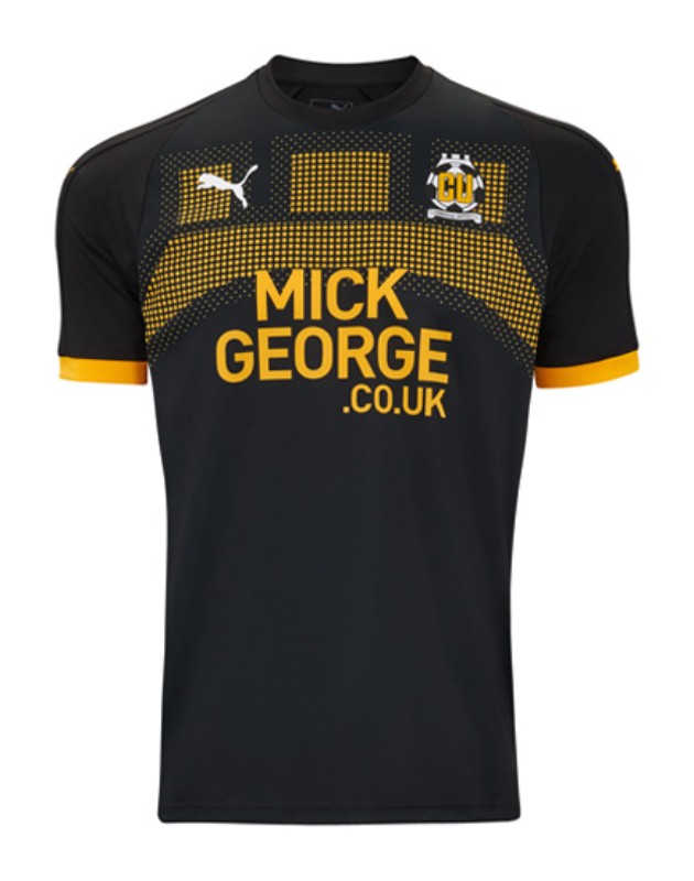
The bridge is already on the current badge though. I don’t see a bridge on the current badge. Nobody ever did, but that's what the turret/castle/fort on top actually is. If people defending the current badge don't actually know what's on it, maybe that's a good argument for updating it?  Updating it to something better than the suggested one of course. Does nobody remember this monstrosity of an away kit from 2018/19, featuring a close up of the same bridge? www.cambridge-news.co.uk/sport/cambridge-university-magdalene-united-kit-14865181 |
|
|
|
Post by milesfenton on Sept 19, 2023 8:48:00 GMT
In the interest of balance, here's what some other football fans thought on Reddit: https://www.reddit.com/r/soccer/comments/16jl133/new_proposed_cambridge_united_badge/
Generally seen as an improvement, if not always glowing praise. The main thing I don't like though is that everyone assumes the book is a nod to the university (and why wouldn't they?). So we'd end up with a badge about the rules of football and a bridge, that everyone thinks is about a university and a castle...
|
|
laker
Youth team star
  
Posts: 1,645
|
Post by laker on Sept 19, 2023 9:18:16 GMT
I think “a” bridge is important as ultimately that represents the name of our great city. Does it have to be that one though? The oldest bridge over the Cam from what I’ve read is Clare Bridge, and given our link to Clare College I’d be more inclined to use a symbol based on this bridge than one more closely associated with the university or city as a whole. But I won’t fight about it if we revert to the existing bridge symbol. Edit: the green dragon bridge is probably more apt for us than one used by the city as a whole - that crosses the river at the closest point to our ground.
I also think the ball has become synonymous with our logo and an evolutionary design which incorporates the ball would be good. I’m keen on the “CU” in amber letters too as it’s instantly associated with us. It doesn’t have to be a total rebrand, just an update with a nod to our past.
And I really like the idea of United In Endeavour being part of the design.
So I’d like:
- bridge
- ball (albeit a lot smaller)
- United in Endeavour
- CU in amber letters
I was also thinking about our fabulous floodlights too but how you incorporate those into a design is beyond me. Likewise a moose or coconuts which would look tacky in my opinion.
I do think circular badges look smart (like Accrington’s for example) and that would give space for “United in Endeavour” to be written.
|
|
JoshHuntCUFC
Youth team regular
 
Posts: 795
Favourite CUFC player: Mark Peters
|
Post by JoshHuntCUFC on Sept 19, 2023 9:49:19 GMT
I think “a” bridge is important as ultimately that represents the name of our great city. Does it have to be that one though? The oldest bridge over the Cam from what I’ve read is Clare Bridge, and given our link to Clare College I’d be more inclined to use a symbol based on this bridge than one more closely associated with the university or city as a whole. But I won’t fight about it if we revert to the existing bridge symbol. Edit: the green dragon bridge is probably more apt for us than one used by the city as a whole - that crosses the river at the closest point to our ground. I also think the ball has become synonymous with our logo and an evolutionary design which incorporates the ball would be good. I’m keen on the “CU” in amber letters too as it’s instantly associated with us. It doesn’t have to be a total rebrand, just an update with a nod to our past. And I really like the idea of United In Endeavour being part of the design. So I’d like: - bridge - ball (albeit a lot smaller) - United in Endeavour - CU in amber letters I was also thinking about our fabulous floodlights too but how you incorporate those into a design is beyond me. Likewise a moose or coconuts which would look tacky in my opinion. I do think circular badges look smart (like Accrington’s for example) and that would give space for “United in Endeavour” to be written. |
|
|
|
Post by whiteswan on Sept 19, 2023 10:56:07 GMT
Good effort.
Do we need our initials though? We could create something really unique which isn’t dominated by ‘CU’. The freedom of creation is limited slightly by the need for ‘CU’. Just thinking out loud.
Perhaps I should fill in the survey…
|
|


